Power with Paula Real Estate
Mover and shaker
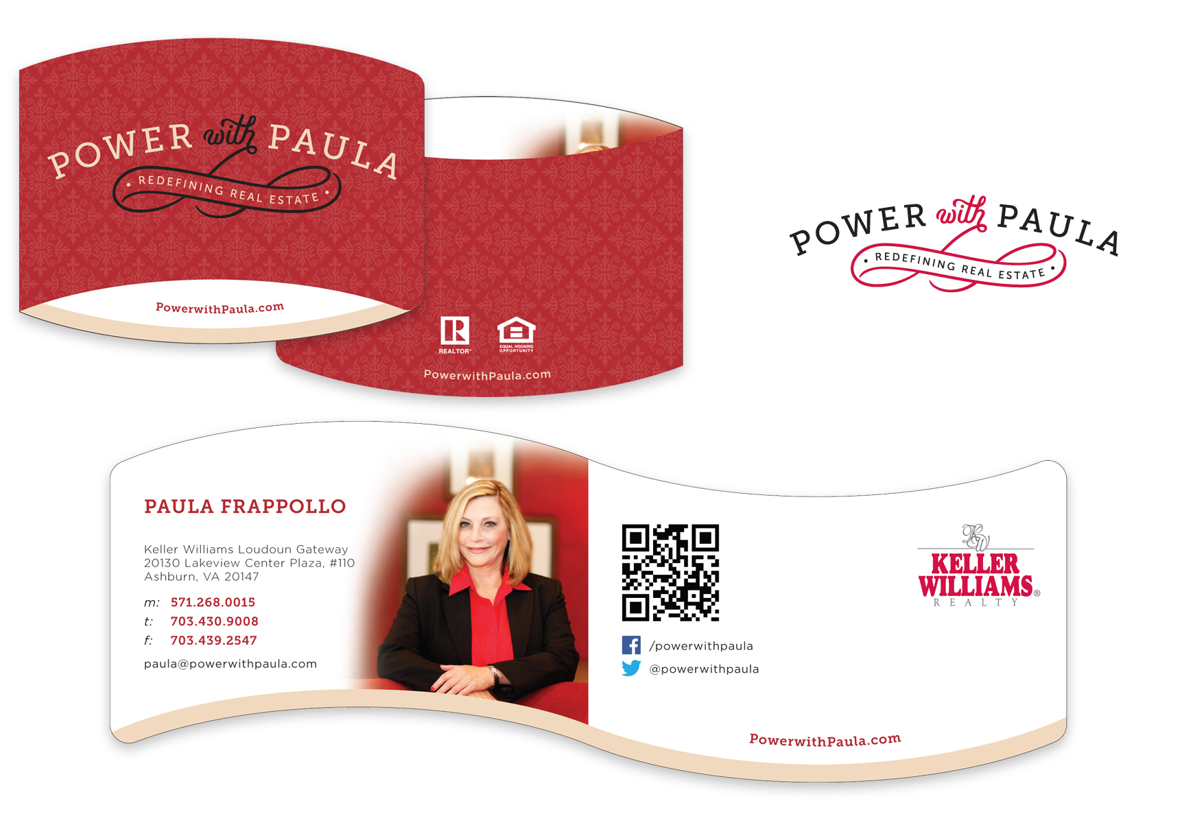
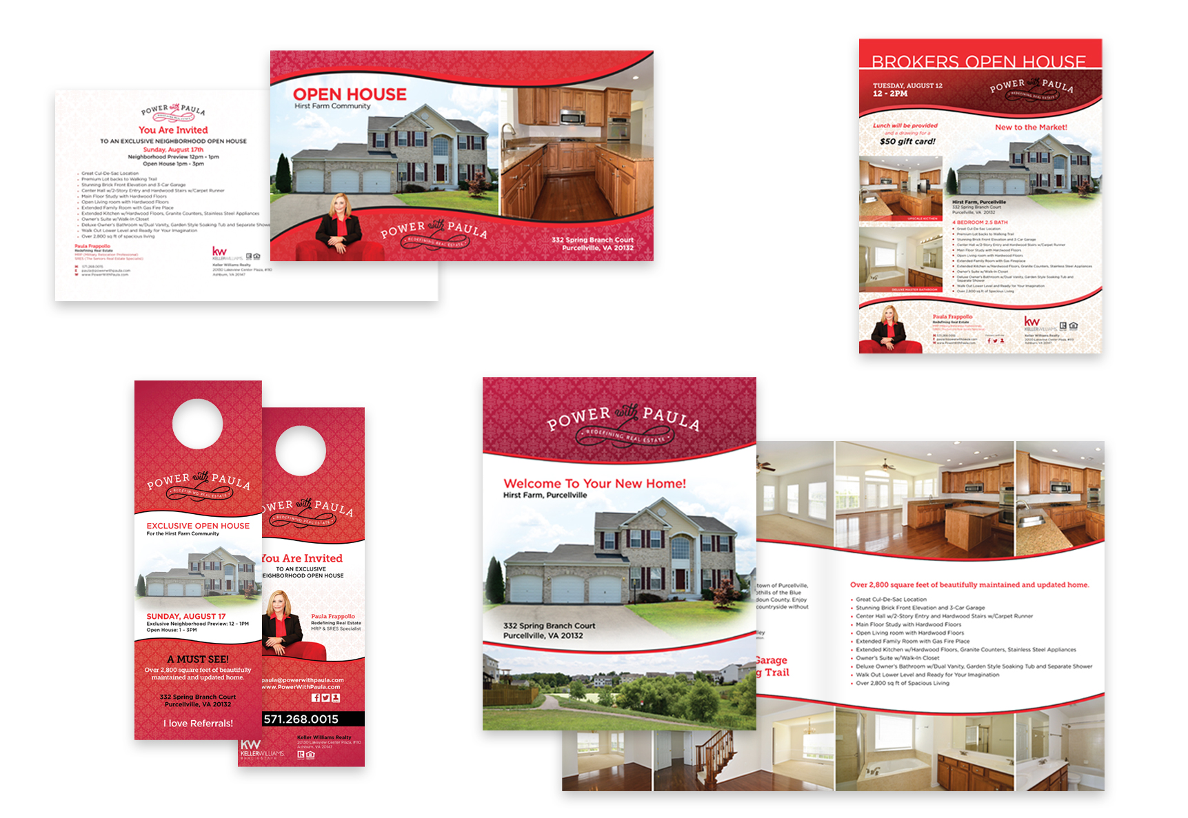
Paula wanted to look different from every other real estate agent in the marketplace. She is in a crowded area for real estate agents (the DC metro area) and knew she needed to set herself apart. After discussing her goals and objectives, we got to work quickly so she could hit the ground running. Using her first name as a starting point, and to project Paula as a knowledgeable, experienced real estate agent, we used alliteration in her new tagline. We then designed a logo identity and business card with a unique die cut to differentiate her and followed that up with marketing and sales materials to promote her properties.
Logo & Brand Identity
Using her first name as a starting point, and to project Paula as a knowledgeable, experienced real estate agent, we used alliteration in her new tagline. We then designed a logo identity and business card with a unique die cut to differentiate her.

Print Marketing Collateral
We designed a series of marketing and sales pieces to promote her properties, including brochures, flyers, door hangers, and email advertisements.

